Friday, September 17, 2010

Interesting Aesthetic

My Edited Photo
I chose this picture because your point of view looks like your on the ground like an ant or a bug. The color in the flowers really comes out and makes the picture pop with the bricks along the wall, makes you feel really tiny. I love it and it doesnt look over done at all.

Proffessional Photo
This picture has an interesting side and a mysterious dark one too. You look at it and wounder if the flower is dying and it's something you dont see everyday. It counts for a very interesting aesthetic picture and its an amazing photo.


Juxtaposition

My Edited Photo
I picked this picture because, the rings touching in a certian curve with it was a pretty cool close up shot. It's a normal picture to me but i was more concentrated on bringing out the metal and the shine of the rings, plus the pattern in the wood. It pops, and doesnt look too overdone or over edited. (:

Proffessional Photo
I picked this picture because obviously the two bulidings look so close togather that the bigger building looks like its in the houses backyard. The detail of the bricks on the house and the glass of the building behind it brings it all togather and does not, AT ALL, look overdone or too much editing done to it. You can even see the clouds reflecting in the windows up front which is interesting.


Triangulation

My Edited Photo
I picked this picture, because i knew his body posture brought out many triangles outside and inside the figure. You don't see many figures where you can see one shape all over the place, usually you can see many. I edited the color to bring him out and not to totally blacken out the background but to make it look more classic than normal.

Proffessional Photo
This photo has a spooky side which i really like and you have to look very close to the picture and find where the shapes are. Located in the swing and alot of other places, the blurred background brings everything else forward and gives it a mysterious side, which is really cool.


Overlapping

My Edited Photo
I picked this picture because i was taking it while my sister was in front of the truck. I think i brought out the steering wheel plus blurred and grayed the background to bring it out even more. So its clear and your concentrating brings it forward to "pop out".

Proffessional Photo
I picked this picture because the photography really brought out the ring let alone the details in her nails and hands.The blurred flowers in the background does what i did and brings your attention forward to the womens hands and ring. Its a very pretty photo and it's different + interesting.

Focal Point

My Edited Photo
I picked this picture because i thought it was perfect for the focal point. Tanner was sniffing the camera when i took the shot and it couldn't have been anymore cuter. The editing really brought out the shadowing of his nose and his warm tan color of his fur. His eyes are a dark brown and actually look very mean with detail even though he's the sweetest dog!

Proffessional Photo
This photo looks really different and i love the editing of it. This is the deffinition of a focal point, because not even looking at the full picture you look straight through the circle to where the tracks disappear. Than you end up looking at the details. I think this is an amazing picture, it's so cool!

Axial Symmetry

My Edited Photo
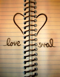
I picked this picture because i thought it was kind've cool with the backward letters and the splitted heart are devided but a big ringed notebook. The dreamy and warm touch to the picture is a little sensetive like, almost like a love story. (:

Proffessional Photo
This photo is very different and probably would've taken forever to get this right shot. Except for the people walking around, the bushes, the walk path and every single design are alike. Plus, to get this perfect shot is a one out of ten chance too; maybe with a little more practice.

Back, Mid & Foreground

My Edited Photo
I chose this picture because the cow in the front is very detailed and close to the picture with the cow further back from him and more in the back. I thought it fit Back,  Mid & Foreground very well. To me it's warm, and brings out the different colors of the cows.

Proffesional Photo
This picture is amazing to me! The couple up front has every detail and look gorgeous while the fountain in the middle is a very cool touch to the picture. It stuck out to me and the detail in the water makes me want to jump in!

Radial Symmetry

My Edited Photo
I picked this photo because its a great, cool lookin shot and the contrast brings out the sun comin through the top of the ride. The blurred out background scene also brings it more to the front and fades in the back. I just really like the way this picture turned out. (:


Proffesional Photo
This picture is pretty cool and interesting to me. It makes me feel like i'm actually looking up, looking at the clouds. It could've been edited just a little bit more to make it interesting and pop out but the clouds above the glass is cool looking enough.

Wednesday, September 15, 2010

How To Photograph Big Groups- Article

By Steve Bedell in the magazine Shutterbug
I learned acouple different things about light, the clothing, the background but mostly posing. With posing i learned that straight lines arn't good and to have someone stand straight up and look at you means that its uncomfortable for them. Layed back and  more normal is what Steve likes to do. He starts with building the group and ususally starts with the parents or oldest couples and starts building around them. and especially avoiding straight lines with the heads. Up and Down shots like different head heights is more of a compisition that is easy on the eyes. I learned alot and now i know that its not right to stand up straight towards the camera.

Breaking The Rules

Proffesional Photo
This photo is obviously colorful and warmin. Putting more than one photo togather for any picture alot, but such a picture that its bright and alive like this is breaking the rules but it still looks amazing!

My Edited Photo
With my picture i thought something extra needed to be added and i really thought lights would bring out a little bit of spark. Makes the picture interesting and very different which is what i was aiming for. (:

Tuesday, September 14, 2010

Rule Of Thirds

                                                                        My Edited Photo
I picked this picture for Rull of Thirds because the angel from the floor takes up half the floor obviously and the angel from the floor to him is perfect plus the lighting reflecting off isn't too bright and has sort've a reflecting mirror going on which i really like.

Proffesional Photo
This photo is adorable and the editing certianly brings out the baby from the back ground blurred out. It brings your attention to the front and draws it to the face. The face takes up half the picture and isn't exactly in the middle which would be really boring and plain, so the Rule of Thirds does come here.

Fill the Frame Photo

My Edited Photo
The fill the frame photo fits this one the best, because its an upclose shot that almost every part of the picture isn't cut out except for a part of his foot. Any closer, and you wouldnt understand what he was doing in the picture. It was difficult to capture the photo in motion and you have to time it write especially with my camera that wasn't cooperating very well. The picture came out great, timing was great, and i think how i edited it really brought out the colors he's wearing with such a dark background and the filling of the frame fits.

Proffesional Photo
This photo was taken in motion exactly like mine. Once again, probably a little harder but it still came out awsome. This picture doesn't look like it was edited very much but even with editing done to it, it still brings out how the bikers fit the frame. Corner to corner you can tell what they are doing and it grabs your attention.

Arrangement Photo

                                                                      My Edited Picture
I picked this photo for arrangement, because I told the boys which way to lean and face there body/ where to put there arms. I think this photo turned out well because its not too over done and edited and still looks good. Their bodies pop out of the picture and nothing in the background complicates the picture so it has your attention on the arrangement of them in the picture.

Proffesional Photo
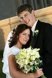
This photo is not like mine but it brings out the arrangement of the couple and blurs out the background like mine. They are placed so both of them are brought out and so the picture can get there good sides. I love this picture because the lighting in the flowers and their faces is all brought out.

Friday, September 3, 2010

Bad photography.

I think this photo is obviously not edited but its not always about the picture being edited. the glare in the windows says its taken from a bad view. Plus, the lighting and contrasting does not bring the picture out at all. In other words it needs pazaaz!


For some people, looks are everything but i think photography is'nt all about how the picture looks. To me, this picture does look amazing, but it's how it makes me feel that i think its a bad picture. Some photography can be gloomy and disturbing but something could've done to make it more alive!


Now this picture, speaks for itself! Bluryness, no focus what so ever! Plus, the view of this shot might've been taken at a different angle for a better view of the water and not just the island. This shot would've looked awsome if it were to be in focus and maybe a little edited on the computer. But a good example of bad photography!

Thursday, September 2, 2010

Picture 3

Now this picture brings a warmer side and i think the warm colors of the yellow really brings out everything. The sun flowers are beautiful with the sun in the picture. And the angle couldnt be any better.

Picture 2

This picture brings out a mysterious and dark side. I think its an interesting picture because most of them bring out a colorful look to waves from the sun with the blue, but the black and white drags you into it and makes you hypnotised.

Picture 1

I love this picture because you never see this point of view on a wave before captured in a photo unless its not real. This picture does not look edited at all and the sun brings out the glisining of the water. It's gorgeous!

KWL

         Photography captures what you see and most people enjoy photo editing their images to bring out more of an interest to the picture. Taking pictures you can save for memories mostly because they're special occasions or something you do not want to forget. What some people don't know though, is how to capture a good shot. Professional photographers know the how lighting must be in shots and how different angels brings different things out of the picture. For instance, the lighting on someones senior picture for example cant be too bright or dark to hide that person in a shade of black or white. You can't take just an ordinary picture either, and that's what editing does to a photo is make it stand out. Different camera's and different equipment besides just editing on a computer also helps that.
        How do professional photographers know how the perfect light hits someone, or what looks the best?
When your editing a picture, how do you know when its too much or too little besides common sense? How do professional photographers take pictures that actually have meaning?- not just pictures their being paid to take, but pictures with quotations and theme's. (like paintings and drawings)